HCF health insurance
PODCAST PROMOTION
The Task: To promote the new HCF Podcast series ‘Menopause Matters.’ Create a series of assets from cover art – using the HCF’s brand illustration style, an animated teaser for social, and website assets for the landing page using imagery of the featured talent. The covert art design must stand out against competitors in the App Store.
Solution: Using the latest AI technology to explore layout options which we later adapted and refined to fit our brand, helping us to reach our final cover art design solution. Four mature women from a variety of backgrounds, looking directly at the audience, smiling with flushed rosy cheeks, stand strongly together in front of the HCF pink background with the Podcast title housed in an HCF-coloured Ruby box.
Role: Freelance Visual Designer
Work completed at HCF

BROCHURE DESIGN
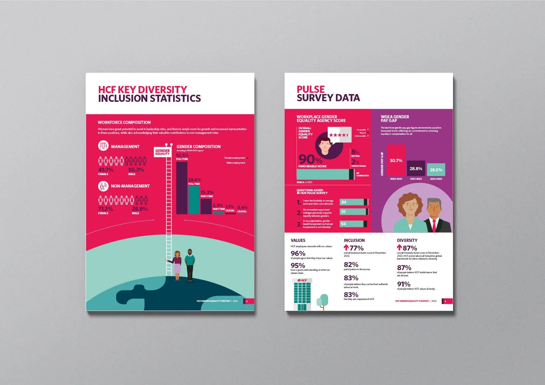
The task: To design a document that addresses modern slavery risks across HCF’s operations and supply chains in the financial year ending 30 June 2022 (FY22).
The solutions: At HCF our values run deep and are at the core of everything we do for our members. In this solution to the brief, we use the pulse to represent these values as a thread running through the organisation. The pulse weaves throughout the document taking us on the HCF journey, displaying our eco-system and our relationships within our supply chain which we represent through illustration. We’re given a holistic view of the HCF world and everyone involved from our people and partners to the communities we serve.
Role: Freelance Visual Designer
Work completed at: HCF


ANIMATED GIF
The task: HCF Members will soon be able to make on-the-spot claims for extras services using a QR code on their mobile phones, making the claims process more efficient and convenient for both members and healthcare providers.
Create an animated gif that demonstrates how members can scan a QR code available through their HCF Membership app at new HICAPS Trinity terminals, providing a quick, easy, and convenient alternative to using their physical membership card.
The solutions: A simple illustrated gif visually displays a breakdown of steps involved to use their QR Code to make a claim.
Role: Freelance Visual Designer
Work completed at: HCF

Animated gif
CORPORATE WEBINAR
The task: Create an illustration representing the theme of the Webinar ‘Optimising your sleep’ which will appear in promotional material advertising the event. Collateral will include a poster design, EDM, and web banners.
The solutions: Using the HCF Brand illustration style, a charming illustration of a young lady blissfully sleeping with stars sparkling in the background and the moon hovering over her whilst she catches up on her sleep. Gentle ‘zzZ’s grow in scale, as she rests.
Role: Freelance Visual Designer
Work completed at: HCF

A3 Poster design and illustration
GENDER EQUALITY STRATEGY


Netball Australia


Digital and UX | UI Designer
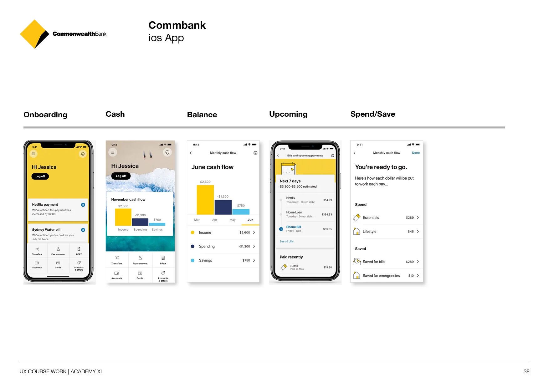
Role: UX | UI Designer Project: Saving App Design Year: 2020
My process
I use the Double Diamond which is a structured design approach to tackle challenges in four easily digestible phases:
Discover: a deep dive into the problem we are trying to solve.
Define: synthesizing the information from the discovery phase into a problem definition.
Develop: think up solutions to the problem.
Deliver: pick the best solution and build that.
Discover Phase:
Project: Sava: UX | UI Experience
The User Problem
Some people aren’t good at budgeting and need a visual to understand their spending habits.
The Opportunity
Currently, there are not many apps in the market that offer this service, so there’s potential to create solutions that address this problem.
The Solution
Representing your bank statement with visual language, in conjunction with categorising your spending habits, can quickly identify areas you’re overspending on. Making it easier to understand and more visible and transparent where you could be saving.
UX Research
The first 2 weeks I started work on this project, I began reviewing the reasons why people were having difficulties saving. I conducted three, one-on-one interviews to discover what was working well and what could be improved.
Next, I looked at user data from a survey I undertook, and by synthesising all this information I could start to see patterns in what could be improved in the user experience. I conducted heuristic evaluations (Meaning: I identified usability problems in the user interfaces) on competitor apps and started to formulate ideas and improvements to their existing experiences before focusing on a new Banking app design.
I identified direct and indirect competitors in the banking space. I conducted a competitors analysis to understand what was working already, and where they lacked, which gave me plenty of features ideas to explore and test. I also created customer proto-personas ( lean persona) from the data I collated.


Developing Insights
Collecting quantitative and qualitative data from the interviews I conducted and surveys I sent out, combined with using methods such as Affinity mapping to sift through large volumes of data I collected, in order to discover patterns and relationships between concepts and ideas. Once I grouped the data (which consisted of facts, opinions, and issues) into meaningful categories, I understood the issues people encounter with being able to save for their futures or specific goals..
Methods included:
Affinity Mapping
Empathy Mapping
Personas
Customer Journey
“A great deal of creativity is about pattern recognition,
and what you need to discern patterns is tons of data.”


Competitor analysis
Performing an audit/review of competing apps provided understanding of the competitors and their customers and helped to assess their strengths and weaknesses, and also highlighted areas for improvement.
The key benefits for undertaking this competitor analysis were:
Allows you to better understand competitors and their customers
Puts you in a place where you can assess competitors' strengths and weaknesses
Informs your design solutions by highlighting areas of opportunity in the market.
From my research, I discovered some apps already had goal setting features, monthly overviews and calendars but I felt like there was still an opportunity to incorporate all the best features into one app, and to add new features such as a ‘Quick Save’ button to prompt you to save.
Define Phase:
The Synthesis of data
Through drawing together concepts, ideas, objects and other qualitative data to create something new. Re-sorting and re-arranging research data without fundamentally changing it. I discovered there was a strong requirement for people wanting to set savings goals. There was a common theme of ‘needing a sense of control and security over their finances. And to be able to make better choices when spending their money. Whether, it’s a house, wedding, or holiday people wanted help to achieve their savings goal. Some people’s income had been affected by the Pandemic, giving them more money concerns than normal, leading to a stronger desire for control over their spending and wanting more guidance on how to save.

Producing
Data Insights
Data is produced as an outcome of your research activities. The information that I gathered needed to be analysed, so patterns and trends could be identified.
Personas
Creating 3 personas helped to envision who the customer is, and who I'm designing for. I was able to build a picture of their needs, experiences, behaviours, and goals. This helped guide my ideation process and helped me create a good user experience for my target audience. This method allowed me to step out of myself, and avoid creating a solution based on my own preferences.
“We use persona to understand our customers,
and to know more about them.”


Customer Journey
Constructing a customer journey helped me to discover what will help people to save more effectively. It helped to build a picture of what the difficulties, goals, and decisions could be around saving, and also identified opportunities for them to improve.
“Discover more about the customer’s ecosystem,
rather than a single point in time.”
Managing Content
Content planning considers user journeys, personas and the platform that will host the content. Information architecture focuses on organising, structuring, and labelling content in an effective and sustainable way. The content strategy closely aligned to IA.
Methods
Information Architecture
Content Strategy
UX Coping Writing
Choosing Features (aka MVP- Minimum viable product)
Once they have been identified, prioritising these Features to see which will be included in the Minimum Viable Product (MVP). This approach helps to create a focused product that users want and that the business can deliver. My personas guided and influenced what became a priority for my identified Features.
Conclusion
My research gave me great insights on what the customer's pain points were, and what they think will help them. After completing the content strategy stage and looking further into my competitor analysis, I gained an informed view of what features in a banking app could help people improve their relationship with saving.


User Flows
A single stream of the interaction with a product, helped me to see the choices presented to the users, and better understand interaction ideas. It also informed ‘What’ I should be building ‘How’ the pages flowed together. By sketching this process first, I was able to uncover potential pain points early.


Develop Phase:
Building Prototypes
Initially I hand drew my ideas, interactions and elements to create screen flow before creating wireframes in figma. Sketching onto paper first allowed me to explore ideas quickly. Designing the wireframes without colour, allowed me to focus on the user flow, without getting caught up in the UI design.


User Testing
User testing helped to find out what was and was not working before investing too much time into the design. I recorded all of the session in a google docs spreadsheet and then synthesised all the feedback insights, into a list of design changes. Some of these items included:
Changing the name of Dashboard to ‘Home’
Colour coding the Calendar
Only displaying one account for the Quick Balance, which reflected the graph states, on the Pre-Login page.
For the user testing sessions, I created general customer questions, opening and closing questions and a series of task based questions. I set the users tasks intentionally to understand how they would interact with the app, and if they could complete the tasks, without helping them. This process gave me a better understanding of what people would do with the real app, and if there were any design issues that needed to be solved before creating the high fidelity design.
Brand Guidelines and Libraries
After I completed user testing, I created a design system and style guide, containing the brand colours, typography, 8 column grid, 8px grid spacing system, basic components and illustrative iconography. And a component library for consistency and efficiency. I created the final UI designs in Figma, ready for the developers to code from.


Deliver Phase

Final Design Solution
A deep purple/blue hue, differentiates the app against competitors in the market. The UI design incorporates illustrative iconography, softening the topic of Finance. Bright colours and a fresh, clean design makes the information look fresh and easy to digest.
Final App Features include:
The Calendar: listing regular income and bills
Setting Saving Goals
Choosing an Emojis to represent the new goal you set
Monthly Spending breakdown
Income, Spending and Saving Overview
Top 10 Saving tips
Notifications when you’re balance falls below $200
An finally a ‘Quick Save’ button
Features

Homepage
Track your payments more easily by using a scrollable screen to checking out your balance, getting top saving tips and see your income, spending and saving breakdown. And use the ‘Quick Save’ which prompts you to save.

Saving Goals
Whether it’s a wedding, holiday or a home deposit, name a saving goal and set a date to work towards. Then choose an emoji that best fits your goal.

Calendar and
monthly cashflow
Calendar feature allows you to easily track your next bill. Whilst the Monthly Cash Flow allows you see your balance.
Feedback
The design has been well received by potential customers, and they were happy about the following new features in particular.
Most liked features:
– Goal Setting
– The Calendar
– Receiving notifications to warn you when your balance gets low
“I wish my banking app included all
these features, especially the calendar.”
“ More banks should visually represent how we spend our money”
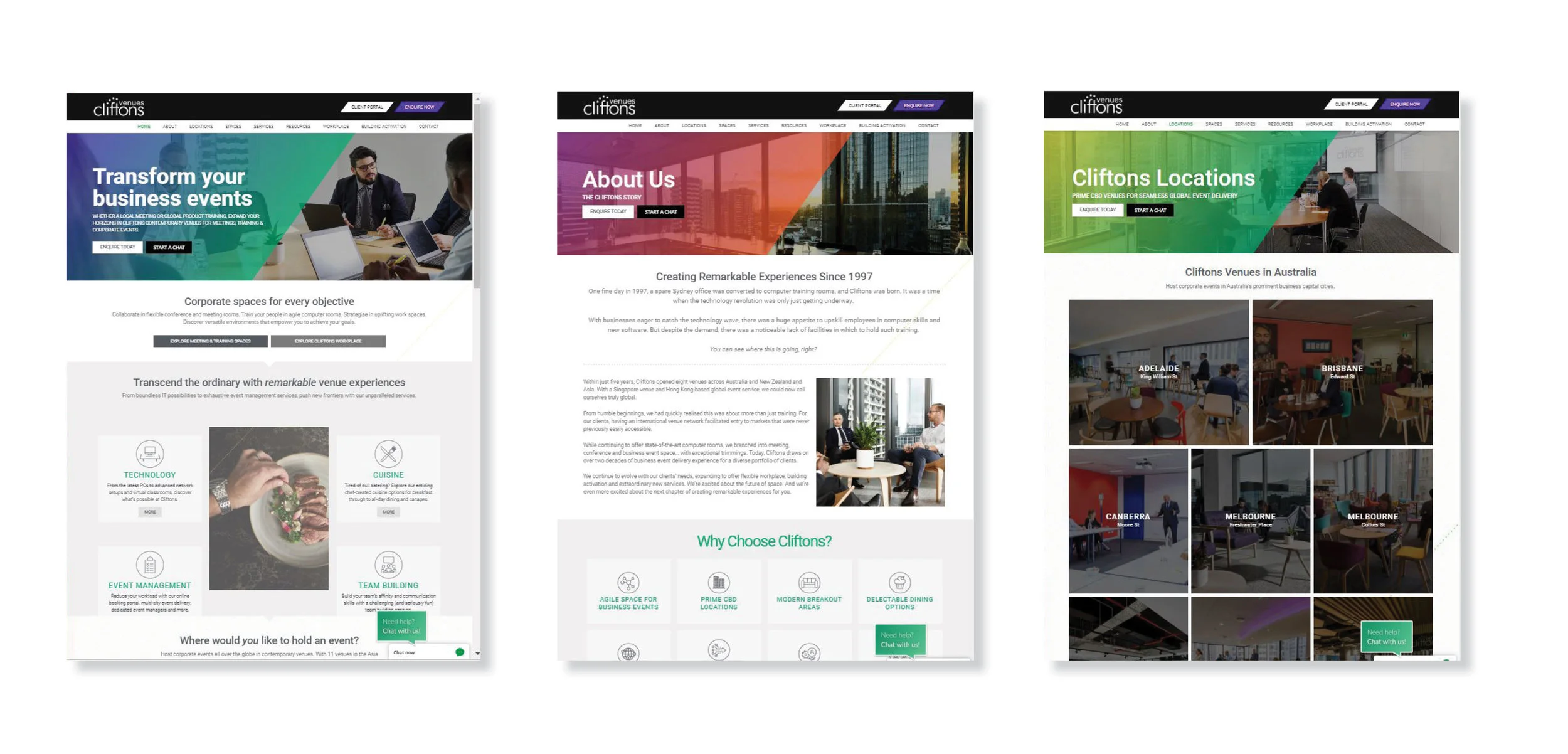
Cliftons Lead Designer

The Role: Responsible for Leading the brand look and feel, and all Cliftons marketing material and brand development.
Company Background: Cliftons is a trusted partner for global conference and event management solutions. They are a venue and platform-agnostic conference organiser for events large and small. They’ll help you find the right venue (theirs or somewhere else entirely) for in-person, virtual or hybrid conferences that create a real impact.
Work completed: In-House
DESIGN SYSTEM

Project: Cliftons needed new brand guidelines to support their growing marketing demands.
Action: The creation of Brand Guidelines allowed external contributors to produce a recognisable consistent look and feel, that fell in line with the in-house collateral.
Result: With new brand guidelines behind them, external contributors were able to produce engaging, marketing material using the assets and design system supplied.


Web Design
Project : Lead designer throughout a company wide marketing transformation.
Action: Specifically re-designing theWebsite, creating wireframes, Persona creation, customer journeys, user flows and information architecture.
Result : As a result the website ranking improved by more than 90 % in the last 3 years in Australia and more than 50% globally.

Wire Frames
Web design
Promo Video


Storyboard

VIDEO DIRECTION
Art Direction


Look Books

STOP MOTION
Global Events Handbook

Advertising

Maps

Directions & Parking Guide
Signage

Venue Signage

Social Tiles

The Body Shop - Retail Concepts

STORE FRONT
2D DESIGN
The task: To enhance The Body Shop’s existing retail experience with engaging displays designed to showcase best-selling /new products and their ingredients, highlighting their beauty benefits.
Solution: Producing an ingredients-focused store front which highlights products through the use of a photo montage style combined with a fun, playful use of typography. Alternative window displays reflect the brand values by actively taking over the shelving space, wrapping around products and combining illustration to highlight key ingredients.
Role: 2D designer
Work completed at: Imagination


NAB Guidelines

BRAND GUIDELINES
The task: To create a set of interim guidelines which keeps all parties informed on how to produce any brand communication whilst the main identity is being developed.
The solution: Produced a set of fun, engaging and eclectic postcards: something you would like to pin on the wall, mix of graphics, illustrations, type and photography. The front of the card engages, on the other hand, the back provides information.
Role: Junior Designer
Work completed at: Principals


National Education Association WITH The Funktion
THE TASK
Designing style frames, setting the look of the project, and storyboard designs ready for animation (Animation by The Funktion).
Role: Illustrator/storyboard artist
Work completed at Freelance project for The Funktion. Client NEA (National Education Association)

Storyboards for animation

Storyboards for animation

Storyboards for animation

Storyboard for animation
x4 typographical/illustrative images, x4 motion graphics storyboards and, x1 animated file between 15-30 secs based on the 4 themes of Wellness.
CITY OF SYDNEY
Objective
The objective of this internal communications work is to encourage CoS staff members to be aware of, engage with and employ wellbeing practices.
The task
The MarComms manager (Internal Communications) has briefed you to create an overarching look/feel for this campaign. The graphics will be used in posters, online and on digital screens.
The themes are:
1. Move and eat well
2. Sleep
3. Practice kindness
4. Discover mindfulness
The Brief
Develop a design concept, provide a creative rationale and 4 x typographical/illustrative images based on the 4 themes (1 of each kind). Provide a motion graphics storyboard for each of the 4 themes. Select one of the themes (your choice) and create a final animated file between 15 – 30secs (no sound). The tone should be bright, playful and inviting.
Rational
Four typographic illustrations visually represent themes of Wellness in playful, eye-catching and impactful designs. Big type wriggles and jumps, eats other letters, gets ready for bed, demonstrates practicing through repetition and cleverly hides a positive mind in the word ‘mindfulness.’ The journey engages the audience through the typographic illustration then leads them to the detail of each Wellness campaign raising awareness for each theme.
Brand colours are used in cheerful and bright combinations throughout and can be adapted to sit on white backgrounds as shown on the Poster’s designs.


Tolv Stockholm - Branding
The Situation: Tolv, like many stadiums, found that although it was busy whenever it hosted blockbuster events once or twice a week, it was empty the rest of the time and therefore not bringing in any revenue. We found a profitable solution to this problem, turning the unused space underneath the arena into an entertainment hub.
Action: A flexible strategy available 12 hours a day, 12 months a year, Tolv is both a destination and a frame of mind, unchained from the irregular rhythms of the sports/music calendar. We created a buzzing hub that’s formed from a series of meaningful branded surprises to showcase Stockholm’s sport, music and culture, as well as a restaurant and bar.
Solution: This concept is echoed in the new logo which features a reversible black and white clock graphic representing night and day, with the 'o' of Tolv echoing a clock dial, pointing to 12. It encourages people to make the most of their time. Creating a brand identity that is simple yet flexible with contemporary modernist yet fun feel and brand guidelines supported this.
Role: Mid-weight designer/illustrator: To create a set of illustrations for the brand guidelines for the support of an identity created by Imagination for the entertainment district. Tolv Stockholm is a collection of retail outlets, pop-ups and leisure areas in Stockholm’s Tele2 Arena in the Globen City district
Awards Venue of the Year
Work completed at: Imagination
Brand Guidelines

Brand Illustration Suite


Brand Collateral


“Tolv heralds new-thinking in enhancing both the matchday and non-matchday experience.”


“VENUE OF THE YEAR AWARD
Tele2 Arena (Stockholm), Sweden”
Woolworths Halloween Retail Campaign

BIN WRAP
Asset Creation
Objective: Using elements within the merchant guidelines to create a festive lock-up for Halloween which differentiates it from other events and clearly references Halloween.
Solution: A watermelon monster bites a slice of our ghoulish Halloween lock-up.
Role: Senior Designer
Work completed at: M&C Saatchi

BIN WRAP
CATALOGUE

WOBBLER

WOBBLER

WOBBLER
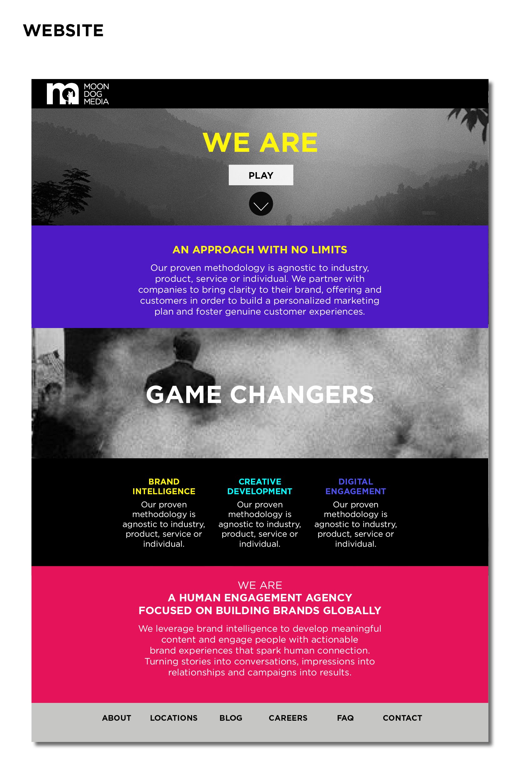
MOON DOG MEDIA
Branding & Identity
The Situation: MoonDog Media is a native content marketing agency based in Melbourne, which needed a contemporary brand identity to cut through the competition. A results-driven, strategic creative agency with journalism at its core, Moon Dog Media fills the gap for a content marketing and comms agency with legitimate experience on the mass market media front line.
The Action: The identity created is clean, accessible with a contemporary feel and a bright colour palette. It’s welcoming, informative, and fits well with the cutting-edge native content offered at Moon Dog Media.
Result: We don’t do agency smoke and mirrors or BS buzzwords, and we don’t spend our time entering industry awards for prestige. We’d rather work hard for you and do what we do best: applying our journalistic sensibilities to bring your brand’s story to life and to make it as engaging and authentic as possible, be it through video production, blog management, copywriting, creating marketing materials, comms or social media strategy, PR consulting, podcast creation, branding, or custom print publications.


Animation
Storyboard

Brochure Design


Web design
“
If you’re looking for highly creative and engaging content that really speaks to an audience, Moon Dog Media should be your go-to.
”
SOPHIE ROBERTSON SCARVES


Vodafone Retail Campaign

IN HOUSE INTEGRATED DESIGNER
The task: To role out the brand style throughout a variety of mediums including catalogue, retail banners, adverts, eNews and eDMs.
The solution: Incorporating brand elements, such as the use of Vodafones graphic device ‘the rhombus,’ the right tone of voice and brand imagery to communicate a variety of offers and benefits of the Vodafone products.
Role: Integrated designer
Work completed at: In-house


Floating Cinema Logo Design
Floating Cinema
Floating Cinema Logo Animation

LOGO & DEVELOPMENT
Floating cinema is outdoor cinema experience where we cruise round on a boat and show you classic films on the top deck with the iconic Sydney harbour as a back drop.
The task: To create a logo the reflecting the floating nature of the cinema experience
The solutions: The wavy lines represent the water. The use of Black and white was to reflect the cinematic experience. The pink ring represented a floating ring.
Role: Freelance Senior designer
Work completed at: Floating Cinema


City Bridge Trust Annual Review

THEME CREATION
The task: To illustrate the key themes ‘Ensuring future growth’ for this year’s City Bridge Trust Annual Review. City Bridge Trust aims to address a variety of causes by supporting charitable activity across London through quality grant making and related activities within clearly defined problems.
Solution: A graphic device made from growing circles is used through-out the brochure; provides a visual representation of how the Trust’s money is utilised for a variety of different causes. Real, authentic and optimistic images accompany the graphic.
Role: Concept & Execution
Work Completed at: Luminous


Navy Health - Branding
The task: Explore possible design/look and feel directions, addressing the basic elements of the brand identity – in this instance brandmark, colour, language, typography and image style. Demonstrate how the look and feel will be applied across up to four indicative applications: letterhead, website home page, brochure cover and internal spread and press ad. Explore the descriptor to ensure that the wider Defense Community (especially Army and Air Force) are aware that they are eligible.
The solution: Creating a brand identity that is bolder and more con dent, as well as friendly and engaging. Providing an Improved understanding of who Navy Health cover is for and subsequent increased awareness (particularly among the Army and Air Force) and therefore membership sales.
Role: Designer
Work completed at: Principals


Ampersand Cafe & Bookstore
Brand Identity/ Logo Design
The task: To evolve the current logo and create brand guidelines for Ampersand cafe and bookstore.
The solution: Evolving and adapting the existing logo - changing the font to be less ‘Wild West.’ Making the coffee cup symbol more prominent and adding the books on the stem of the ampersand represented the concept of a bookstore.
Role: Senior designer
Work completed at: Freelance

Animated logo
Logo

Colour palette

Letter Head

Menu

Merchandise

Loyalty Cards
I like to integrate my Fine Arts background into my work as a Freelance Graphic Designer and illustrator, exploring basic styles to more complex and detailed artworks.


